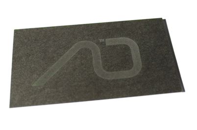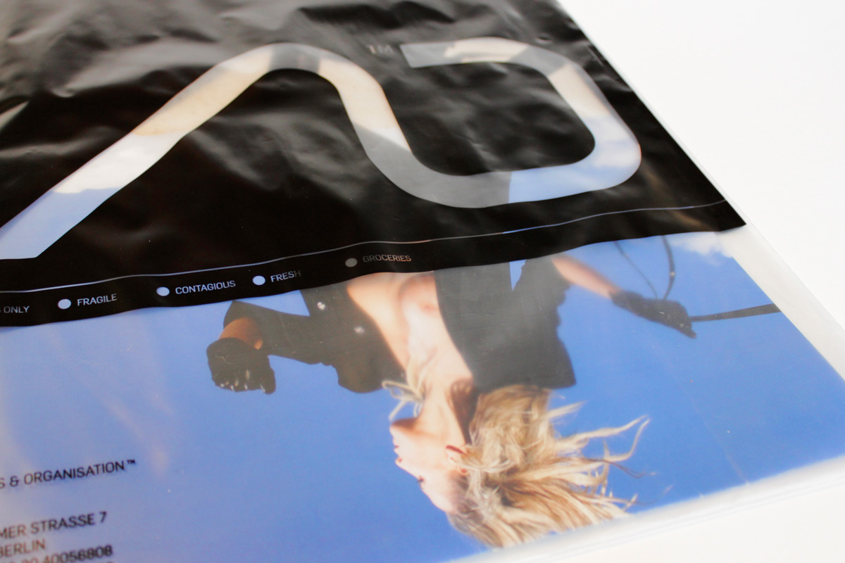
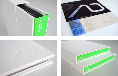
For a photography agency a name and a corporate identity were needed. After a strategic branding process and the development of a brand image “A O” was selected from a range of solutions as an acronym for the visual identity. It stands for “Artist and Organisation”, but also for “Alpha and Omega”, the first and last letters of the Greek alphabet, and hence for the core service of the agency, which covers all aspects of business. Furthermore, the ligature of the logo stands for the relation between clients and photographers. With the visiting card a further aspect of the agency’s core values could be reflected. The card is printed with thermo-sensitive ink, and only becomes clearly visible in fluorescent green through the warmth of the hand when touched. With this special effect the idea of making the impossible possible or of making something visible in a special way is communicated.
The project was realised with Tobias Honert and Jan Wirth.