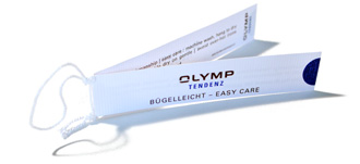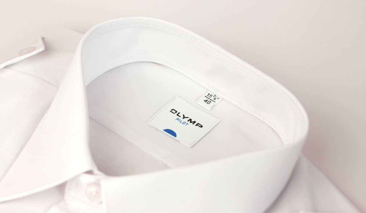
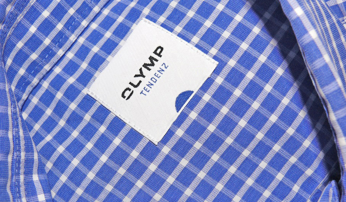
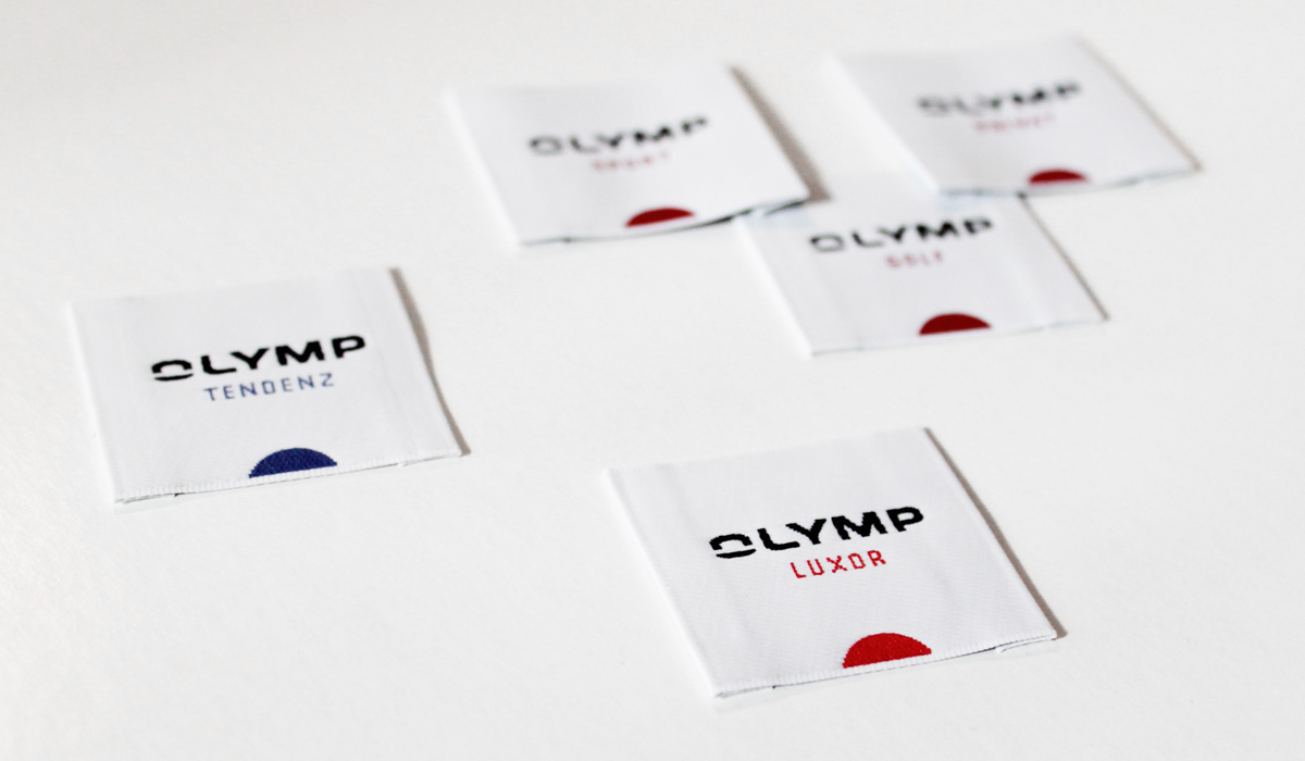
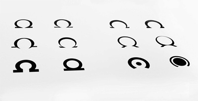
In its former corporate identity the brand Olymp had used the Greek letter omega. Since in the perception and interpretation of this sign, it repeatedly came into conflict with the world-famous watch brand Omega, the re-launch should develop the idea of the omega character in such a way that the brand as logo could be positioned more independently. The exploration of the sign led to the realisation that the brand appeared more independent, compact and individual when the opened “O” is integrated into the logo as a quotation of the sign.
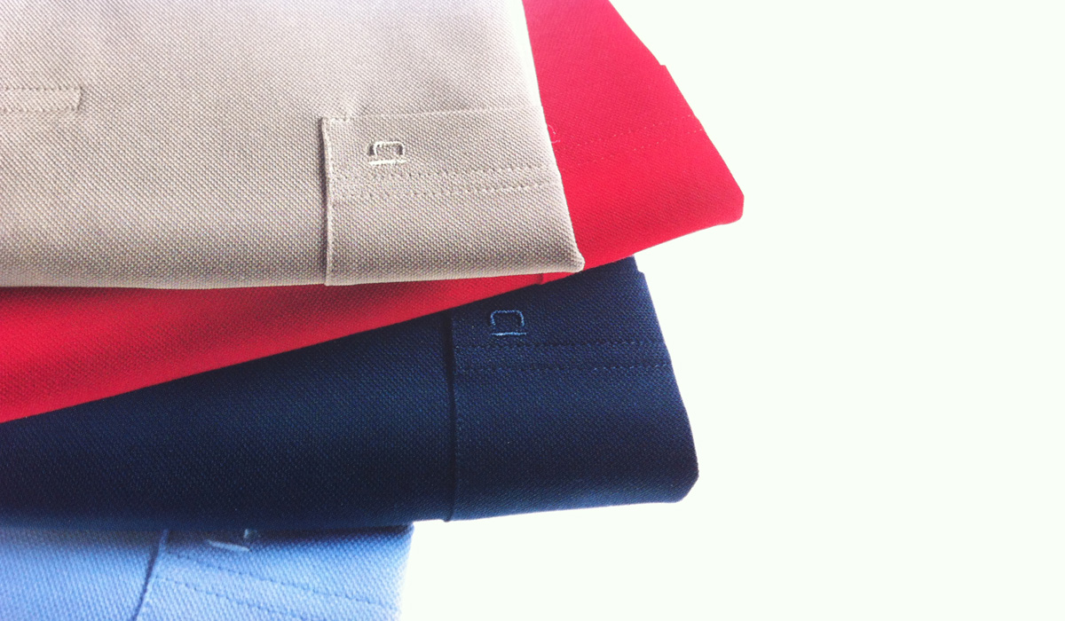
In this way the trademark as a sewable emblem and representative of the whole brand has become more suitable for manifold uses in the branding process. The integration into the whole logo appears very homogenous and natural. Likewise a part of the branding process was the design and differentiation of the whole Olymp product range in its individual manifestations.
Designed as senior designer for Peter Schmidt Studios.
