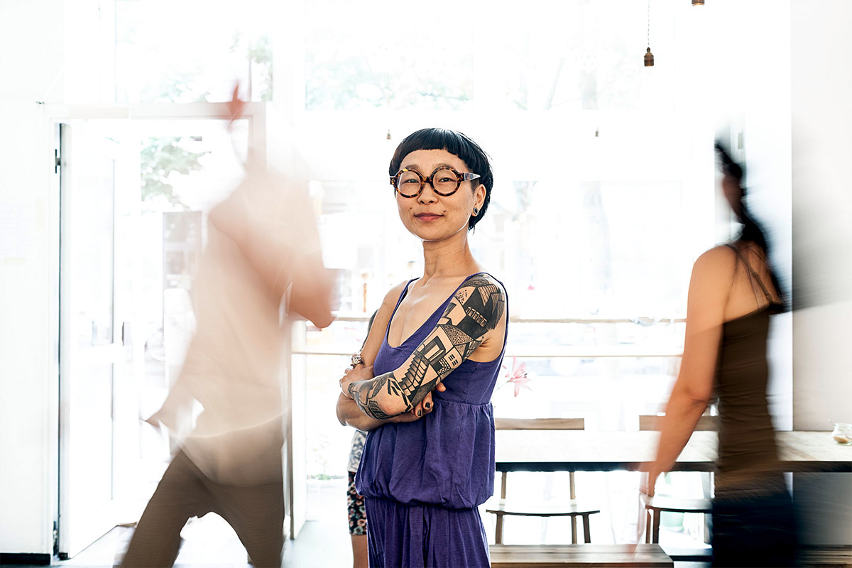
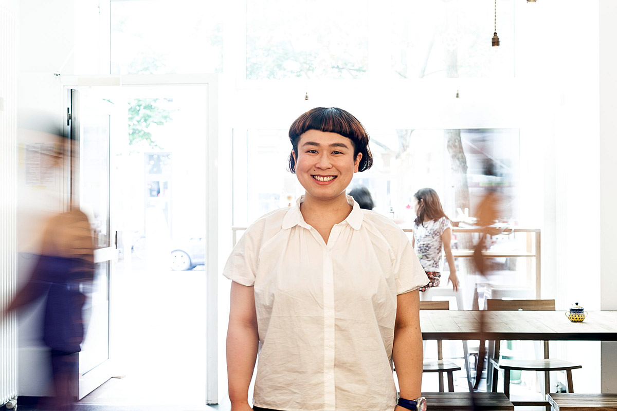
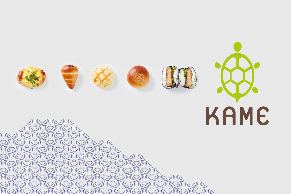
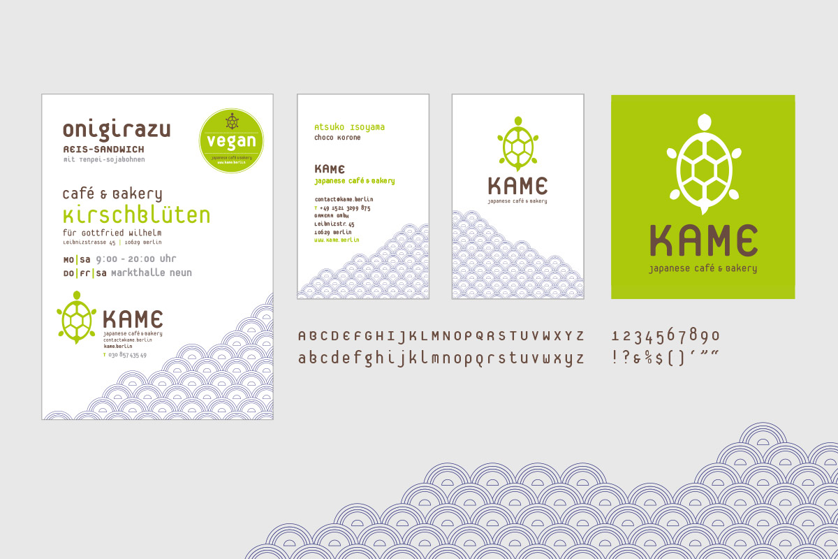
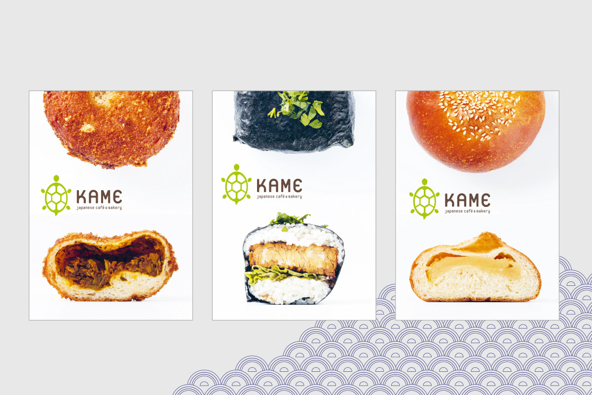
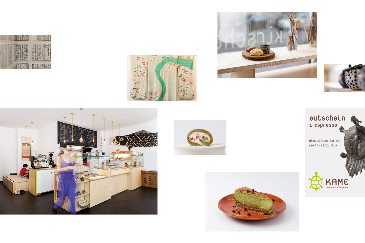
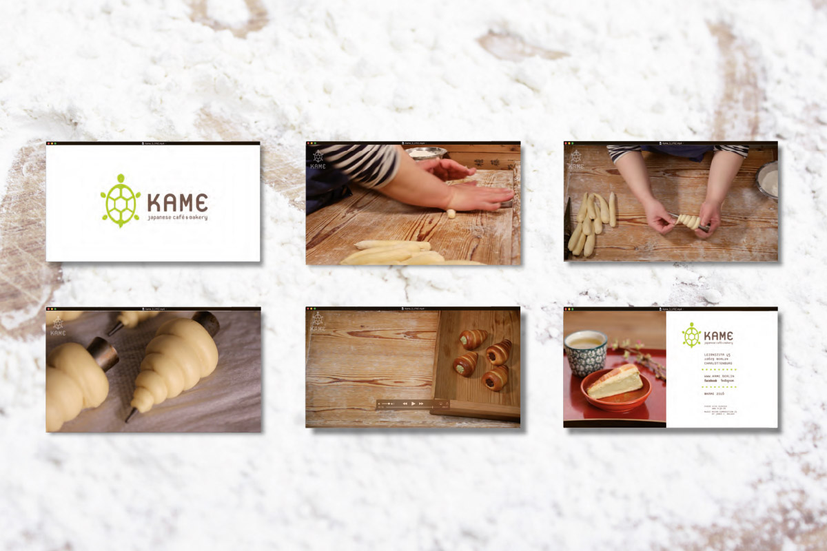
For the Japanese catering brand KAME a visual identity was created to provide a strong and consistent representation for the various bakeries, cafés and event stands. The name KAME is derived from the name of the master baker Kaoru Kameyama, but also from the Japanese word for tortoise. In Japanese culture the tortoise is a symbol of good fortune and long life. For many Buddhists, to be reincarnated as a tortoise is something to strive for. No other animal has as many positive attributes as the tortoise. The basic elements quoting Asian visual culture that are used in the design are employed in a flexible way in a number of the brand’s touch points. The special ingredient matcha, which is used in many pastries and drinks, and is characterised by its typical shade of green, is referred to in the design as the primary colour. The films, which take a pedagogical approach, and the photography were individually calibrated to the design.
Oishii「おいしい」is Japanese for “delicious”; Itadakimasu「いただきます」means “enjoy your meal!”
Foto: Magnus Aspelin, Film: Oleg Klassen