With around 18,000 products, Hama GmbH & Co KG is one of the world's leading manufacturers and distributors of accessories in the product areas of photo, video, audio, computer and telecommunications. The company employs around 2,400 people at 18 locations worldwide, including 1,500 at its headquarters in Monheim, Swabia.
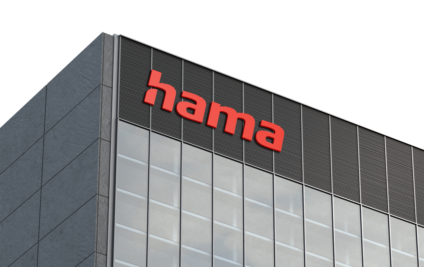
Over the past 99 years, the trademark has changed again and again. The current version has shaped the brand's appearance since 1968 – that is, for 53 years. Our task was to optimize the trademark and to fix technical weaknesses of the "aging" word mark without changing the formal characteristics and thus the familiar appearance.
The revised trademark continues to guarantee a high level of recognition and represents the new as well as the traditional. Typical features such as the Italic font style or the two-story 'a' have been retained. The spaces between and inside the letters have been optimized and the connecting lines removed. This ensures better legibility, even at the smallest display size. In favor of a clearer, more powerful implementation, the "registered" character is omitted at the end. The logo color, Hama red, becomes brighter and 'warmer' and thus, like the entire brand identity, more emotional.
Designed as creative director with Playframe and Monospace.